Tuesday, November 29, 2011
FAVORITE FLAGS BY SCORE: Originality
Monday, November 28, 2011
FAVORITE FLAGS BY SCORE: Simplicity
FAVORITE FLAGS BY SCORE
Hey readers (if there are any of you left from the past two-plus years I haven't posted on this blog)! Lately I haven't been actively flag-designing for existing political entities, but who knows; sooner or later I may start that again. Anyway, before I continue, let me say that I have gotten a little more knowledgeable of certain things in the time that's passed since the early days of this blog. One of the things I've learned is that criticism is often best when it is thought out. By reading some of my past posts, you can tell that I didn't always think that. I overused words like "stupid", "ugly", "worst", and "bad". Many of the flag designs I've criticized are indeed stupid and ugly, but hearing that after so many times gets annoying, even to myself, the author, now. So sorry to those of you I annoyed. I was also a very pesky member of the vexillological community some years ago, so if any of you NAVA members happen to stumble across this, sorry about that.
Sunday, March 1, 2009
YouTube

Sunday, September 7, 2008
Hungary
Canadian Thanksgiving Day

The flag's proportions are 1:2, the most common flag proportions in Canada. The colours of the flag are the Canadian colours, red and white. The partial cross represents separation from England, and is in the shape of a T, for thanksgiving. A representation of the constellation Orion appears on the hoist side of the flag, symbolising harvest time. The constellation on this flag is made of thirteen stars, representing the thriteen Canadian provinces and major territories.
Thursday, June 19, 2008
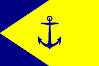
Anchorage, Alaska

The current flag of Anchorage is yellow with the city's seal on it, and of course, the word "ANCHORAGE" on it, in all caps. Although it's unique, it needs a much simpler format. My design keeps the uniqueness, but retains all symbolism, and looks as good at the current flag, possibly even better.
Monday, March 31, 2008
Ontario

In this design, I a red background with a white cross. The red and white are the colors of Canada, and the cross hints at the United Kingdom, but doesn't scream it like the real flag. I took the green shield with leaves and transformed it into a canton for this design, and the result looks as Ontarioan as anything.
A masterpiece, if I do say so myself.
Serbia

I kept the Serbian tricolor of red, blue, and white, and instead of the coat of arms, I placed a Serbian cross in the canton area of the flag. It's golden because Serbia is looking forward to a "golden" future.

